Here are images from my music video which shows how they are referenced to the film Confessions of a Shopaholic. A lot of shots taken from my video are very similar to the ones in the film which were my intentions so that it was easier for the audience to point this intertextual reference out.
I really liked this certain shot in the film of character Rebecca Bloomwood sorting out her wardrobe so I decided to recreate this scene for my music video, where the artist is sorting out her wardrobe too. To make the intertextual reference more noticeable to the target audience I have tied a silk band around the artists head, like Rebecca Bloomwood's. I also placed her on the right side of the frame (rule of thirds) exactly like the shot in the film. As you can see by looking at both of the photo's the reference is clear.

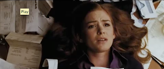
The narrative of the song in the end is that she loses all her money. In the film she finds all her bills that she needs to pay, and theres a close up shot of her in the middle of the bill letters. I thought of a way that would be equivalent to this dilemma, but instead used money at the side of my artist, with the money going up.. then back down, with the artist showing different emotions to convey what she's feeling when theres more money beside her - then less money beside her. As you can see from the two images the intertextual reference is quite easy to recognise. I think this is playing on the idea in a funny way of the stereotype that women spend all their money.


The shot of Rebecca Bloomwood touching items of clothing in the film really shows the characters love for the clothes ect. So I wanted a similar shot in my music video to show the same thing. I got a variety of shots of the artists brushing through items of clothes, looking at certain items, and picking up clothes to purchase them, which gave the same 'I Love Clothes' feeling in my music video like in the Confessions of a Shopaholic film. This scene also emphasises the representation of women that love to shop, or have an 'obsession' with clothes. The way she's looking at the clothes reminds me of Laura Mulveys theory of the 'male gaze' which puts women in a position to be looked at my men. In this case I think Its changed to the 'female gaze' which is not women looking at men, but women looking at things they love for example clothes, which is quite humorous.


Like in the shot above, I wanted to show her love for shoes. So I took this memorable scene from the film and did it in my own way, where my artist grabs the shoes of the shelf. This also plays on the stereotypical female representation.
I also wanted to create the same scene when she's in the shop surrounded by mannequins... I did this shot and as you can see it's easy to spot the intertextual reference. This scene really shows her in 'her own world' - almost like her fantasy world, full of clothes. I think these scenes makes it look like the character worships the mannequins surrounding her.. As it's almost as if they're looking down at her as theres so many of them, like an army of mannequins.
I wanted the narrative that she loses all her money to stand out, instead of the 'final notice' scene in the film I showed an empty bank out instead.. which has the same effect.
This is the same idea that the mannequins have control over the character
Here are other music video's that have used magazines in a similar way that I have. The first one is in Pinks video Don't Let Me Get Me... and the second one is in Cher Lloyds video Want You Back. I think this is a good way of making an artist come across as glamourous and a typical popular cover girl - which is also a typical representation that we have of female artists. This representation is not just created by the knowledge that we have of magazines already ie; glamourous and model like.. It is represented also by the poses that they do. For example Cher Lloyd is sitting posing in an armchair and Pink is getting her hair and make up done - just like the artist in my music video - These are typical things that we relate to fame and our idea of models being 'perfect'.


